Office Reception Signs in Toronto: A Guide for GTA Offices and Clinics
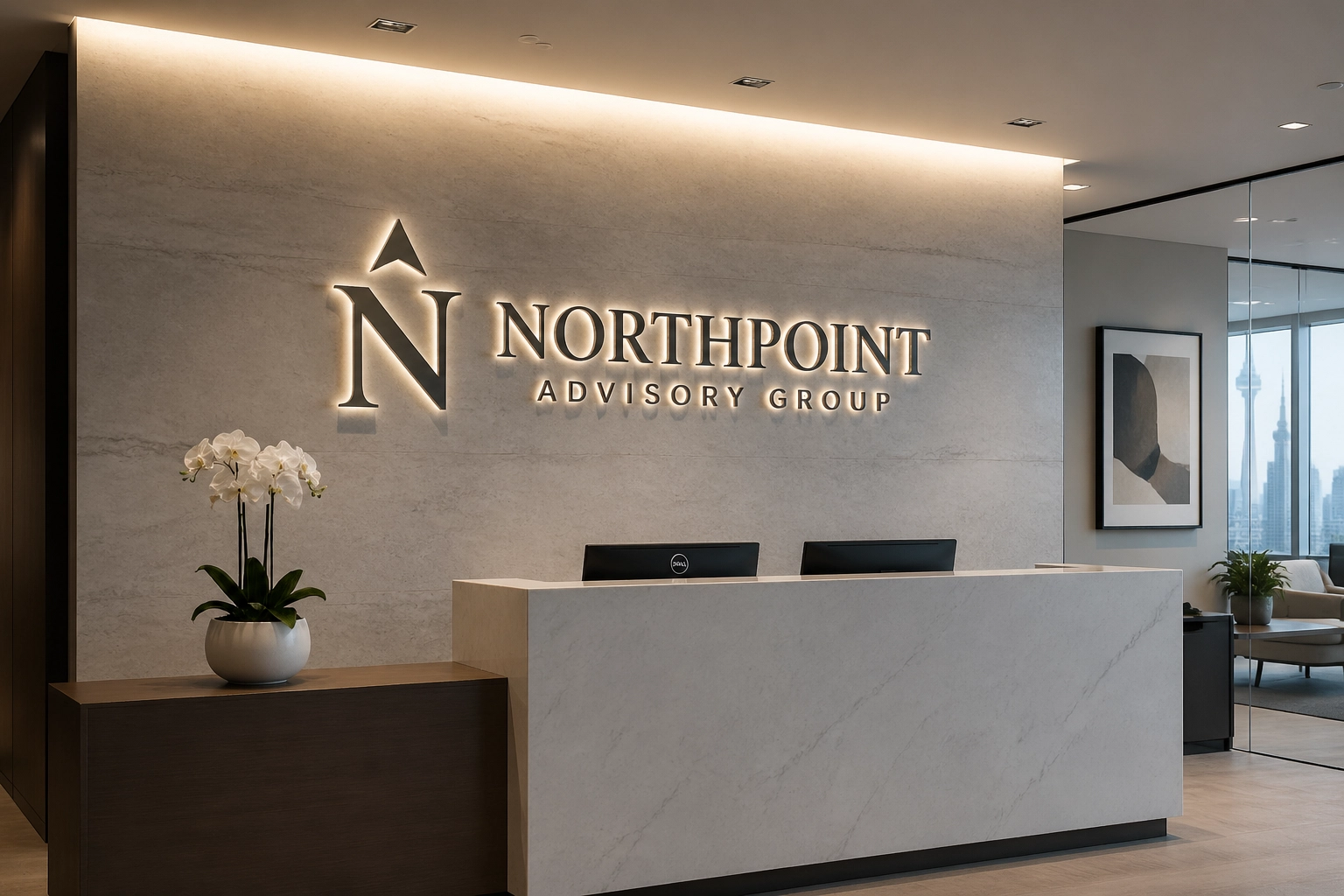

Most reception areas underperform for one simple reason: the sign looks like an afterthought. If a client walks into your office in Toronto, Vaughan, Markham, Mississauga, or Richmond Hill and needs a second to figure out where they are, your first impression is already weaker than it should be.
Office reception signs in Toronto need to do more than fill a blank wall. They need to make the brand feel established, improve visibility, and support a better customer experience the second someone steps up to the desk.
At Visual99, we build reception signage for clinics, professional offices, and commercial interiors across the GTA. If you're planning a new office, clinic, or reception refresh, this guide will help you make clear, practical decisions before you spend money in the wrong place.
The Problem with Weak Reception Signs
A lot of businesses treat the reception sign as a last-minute add-on. That usually leads to three common problems: the sign is too small, the material looks cheap, or the production quality doesn’t match the business.
When that happens:
- Customers hesitate because the space does not feel clear.
- Your first impression drops because the sign looks temporary.
- The customer experience starts with uncertainty instead of confidence.
- The space loses visibility, especially in shared office buildings and multi-tenant clinics.
We see this often in Toronto-area offices and clinics. The website looks polished. The lobby does not. If the reception wall feels generic, people notice.
1. 3D Dimensional Letters for Corporate Office Receptions
If you want a reception sign that feels established, start here. Dimensional letters are still one of the best options for GTA offices and clinics because they look permanent, read well from a distance, and hold up in professional environments.

Why it works
3D letters create depth, shadow, and stronger visibility than a flat print. More importantly, they show that you paid attention to production. Sharp edges, precise spacing, clean mounting, and a properly finished surface all affect the first impression.
Real-world GTA fit
This works especially well in:
- Corporate offices in downtown Toronto
- Professional services firms in Richmond Hill
- Tech and finance offices in Markham
- Developer and commercial offices in Vaughan
A brushed metal logo on stone, millwork, or a painted feature wall gives a reception area weight. A matte acrylic build with crisp painted returns gives you a cleaner, more modern look. Both can work. The mistake is choosing material based only on price.
Practical note: If your wall is large, do not undersize the sign. That is one of the fastest ways to make a good office look unfinished.
2. Backlit and Halo-Lit Signs for a Stronger First Impression
Lighting changes how a reception sign feels. A well-made halo-lit sign gives you warmth, depth, and authority without making the space feel harsh. For many GTA offices and clinics, especially those with limited natural light, this is one of the smartest upgrades you can make.
Why it works
Light pulls the eye immediately. It improves visibility and helps the sign read as part of the architecture instead of something applied afterward. A halo-lit sign also softens the wall behind it, which helps create a more polished customer experience.
Real-world example
We often see this work well in clinic receptions across Toronto, Mississauga, Vaughan, and Markham. Think dental offices, wellness clinics, specialist practices, and private healthcare spaces where you want the environment to feel professional but not cold. A soft halo around acrylic or metal letters gives the desk area a calm, high-end presence.
For corporate offices, illuminated signs also work well in elevator-facing lobbies where people need an immediate visual anchor when they arrive.
If your reception area feels flat or underlit, consider this early in the project, not at the end.
If you want a second opinion before you order, contact Visual99 for a design review. We can help you assess sign type, materials, scale, and wall fit before production starts.
3. Acrylic Panel Signs for Clinic Receptions
For clinics, acrylic still makes sense when it is specified properly and produced well. The problem is that many acrylic reception signs look cheap because the panel is too thin, the print quality is weak, or the standoffs feel generic.

Why it works
Acrylic gives you a clean, precise finish that suits healthcare and professional interiors. Frosted finishes, second-surface graphics, polished edges, and quality hardware all help create a clear, trustworthy look.
Real-world example
In a Toronto clinic reception, a frosted acrylic panel with clean typography and brushed metal standoffs can work extremely well when the surrounding finishes are simple and well lit. In a specialist office in Vaughan or Richmond Hill, this approach often works better than oversized decorative signage because it feels controlled and professional.
What to watch
Do not use thin acrylic with low-grade printed graphics and expect a high-end result. Material thickness, edge finish, mounting hardware, and installation accuracy all matter. This is where production quality shows.
If you're opening a clinic or updating a healthcare reception in the GTA, make sure the material level actually fits your brand and budget.
4. Feature Walls and Environmental Branding That Support the Reception Sign
Sometimes the issue is not the sign. It is the wall around it. If the reception desk sits in front of a huge empty wall, even a good logo can feel undersized and disconnected.
At Visual99, we often solve this by combining the reception sign with a full wall treatment. That might include a paint-defined feature wall, architectural film, branded graphics, texture, or a restrained mural that supports the sign instead of competing with it.

Why it works
It makes the reception zone feel intentional. It improves first impression and gives the sign the backdrop it needs to read properly. This is especially useful in corporate office receptions in Toronto where the wall scale is large, and in clinic receptions where you want a finished look without visual clutter.
A good reception wall should look designed as one system, not as separate pieces added over time. If you're trying to fix a blank lobby wall in the GTA, this is usually where the space starts to come together.
Materials Matter More Than Most Businesses Think
If you want the sign to look expensive, choose materials carefully. This affects durability, finish quality, maintenance, and how the sign reads in person.
- Brushed or painted metal: Best for a refined corporate look. Durable and clean. Strong for offices where the reception area needs authority.
- Acrylic: Excellent for modern receptions and clinics when you use the right thickness, finish, and mounting details.
- PVC with a professional painted finish: A practical choice when the budget is tighter but you still want depth and a clean install.
- Mixed-material builds: Often the best answer for high-end spaces. Metal faces, acrylic backers, stand-off mounted panels, and integrated lighting usually create a stronger result than one basic material.
This is where expertise matters. The same logo can look average in one material and excellent in another. If you are unsure what fits your office or clinic reception, ask before production starts. It is much cheaper to get the spec right early.
Practical Steps Before You Order a Reception Sign
If you are planning a reception upgrade in Toronto or the GTA, do these three things first:
- Look at the approach path: Can people see the sign when they enter, or only after they reach the desk? Visibility starts from the front door, not from directly in front of the wall.
- Match the sign to the wall and the desk: A reception sign should relate to the architecture around it. If the desk is minimal and the wall is massive, the sign may need a feature wall or larger scale to feel balanced.
- Choose materials based on the business type: A law office, dental clinic, medspa, and corporate head office should not all use the same sign style. Keep it clear and appropriate to the environment.

A short review now can save you from replacing a sign later.
Local Expertise Matters in Reception Sign Projects
GTA reception projects are rarely just about putting a logo on a wall. You need the right scale, material, finish, and installation. That is what separates a sign that looks temporary from one that feels built into the space.
At Visual99, we focus on clear communication inside physical environments. That means reception signage that improves first impression, supports customer experience, and matches the standard of the business behind it. We understand how these projects play out in real GTA spaces, from downtown Toronto office towers to clinic receptions in Markham, Richmond Hill, Vaughan, and Mississauga.
Whether you are building a new reception area or fixing one that never looked right, keep the goal simple: make it easy for people to know who you are the second they walk in.
Need help with office reception signs in Toronto?
If you're working on a clinic, professional office, or commercial interior in Toronto or the GTA, contact Visual99. We can help you sort through materials, lighting, wall layout, production, and installation before you move forward.